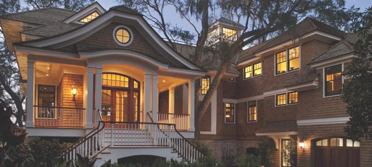
Morehouse Macdonald & Associates is an architecture firm based out of Massachusetts, specializing in detailed, textured, and sophisticated design. Crowd Favorite helped them tell their visual story in the creation of a WordPress website that reflects their high-end style.
We are very pleased with the new web site Crowd Favorite has created for us. Our many business partners and clients have already commended it for its focus on large-scale imagery, which is what best allows visitors to explore the design and craft we put into all our architectural work.
John S. MacDonald, AIA, Principal Morehouse MacDonald & Associates, Inc.
Design
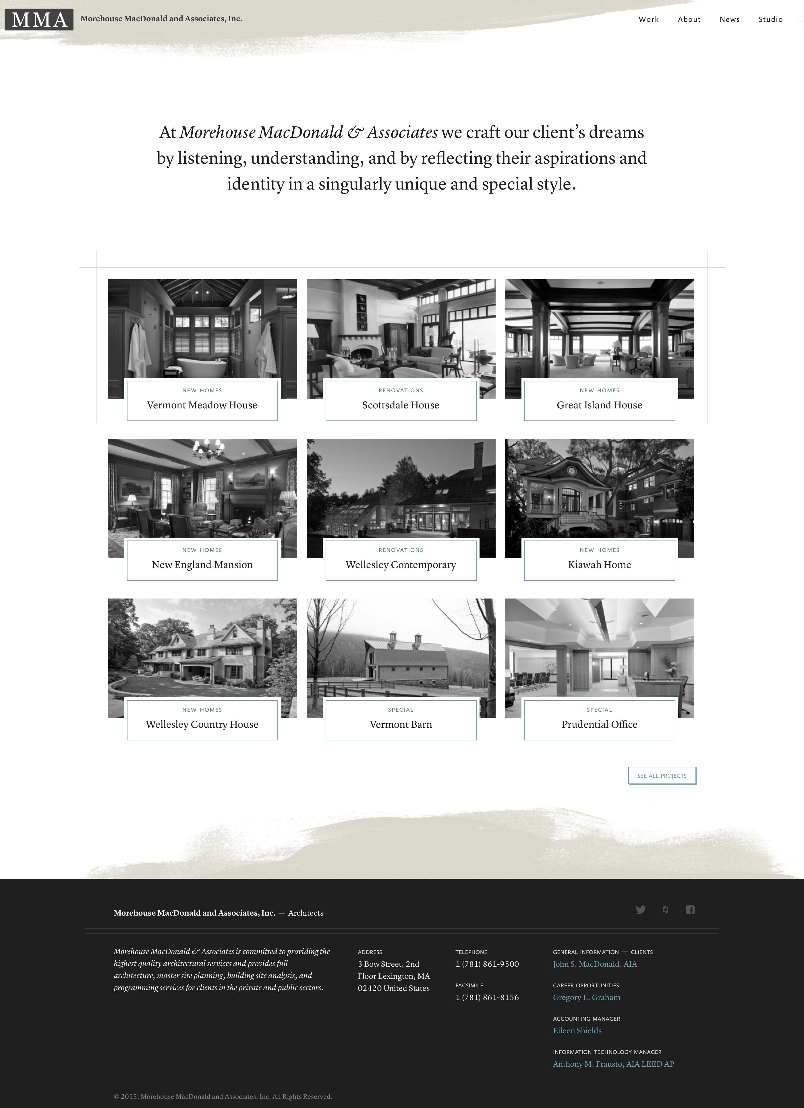
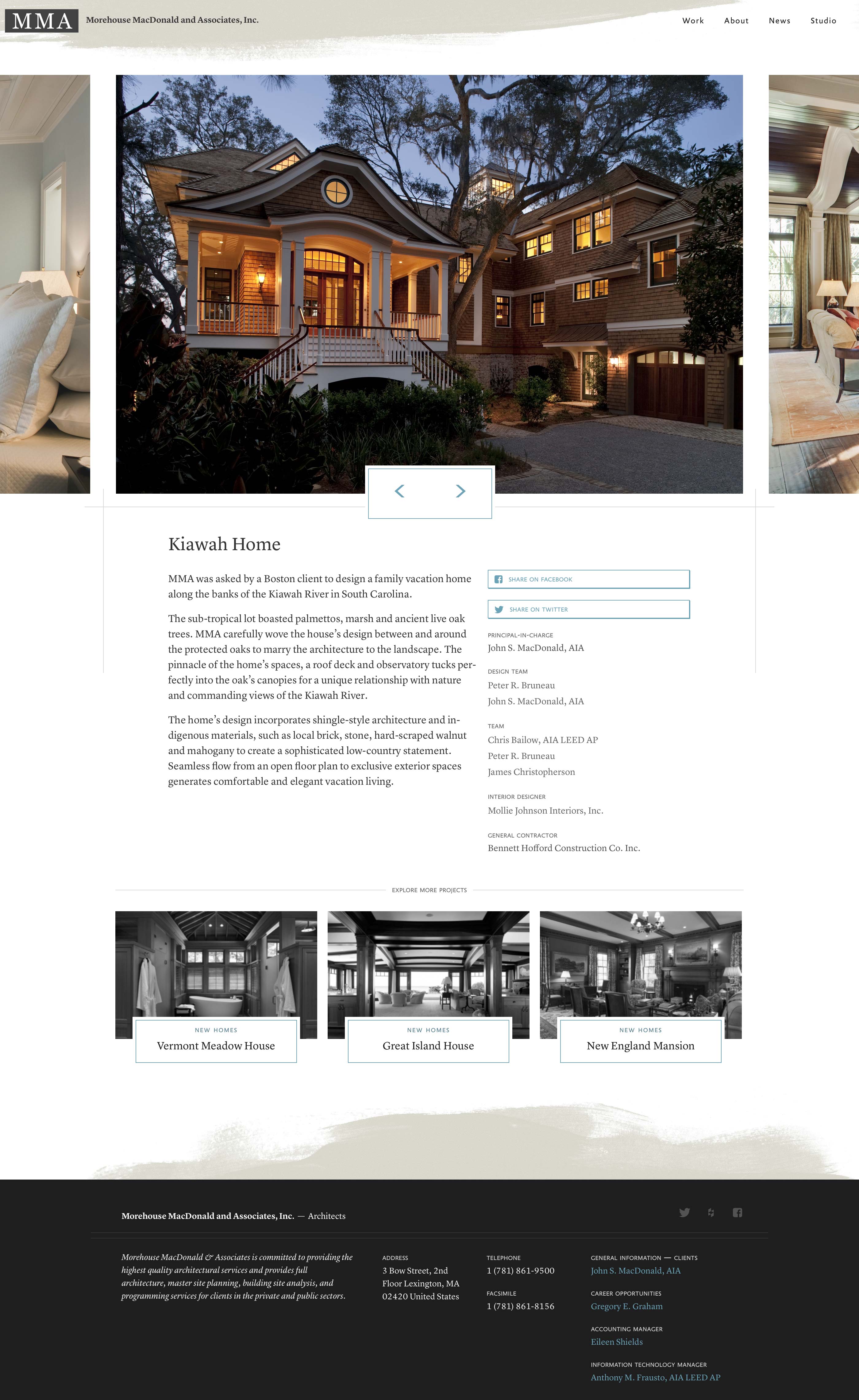
Using large project images, clean lines, and brevity, we created a streamlined flow for visitors all with an emphasis on the premier quality of their firm. The design focus is best featured in the portfolio of work, in the presentation of a classy, sophisticated display with responsive performance and HiDPI support, ensuring their work looks its best on any device.
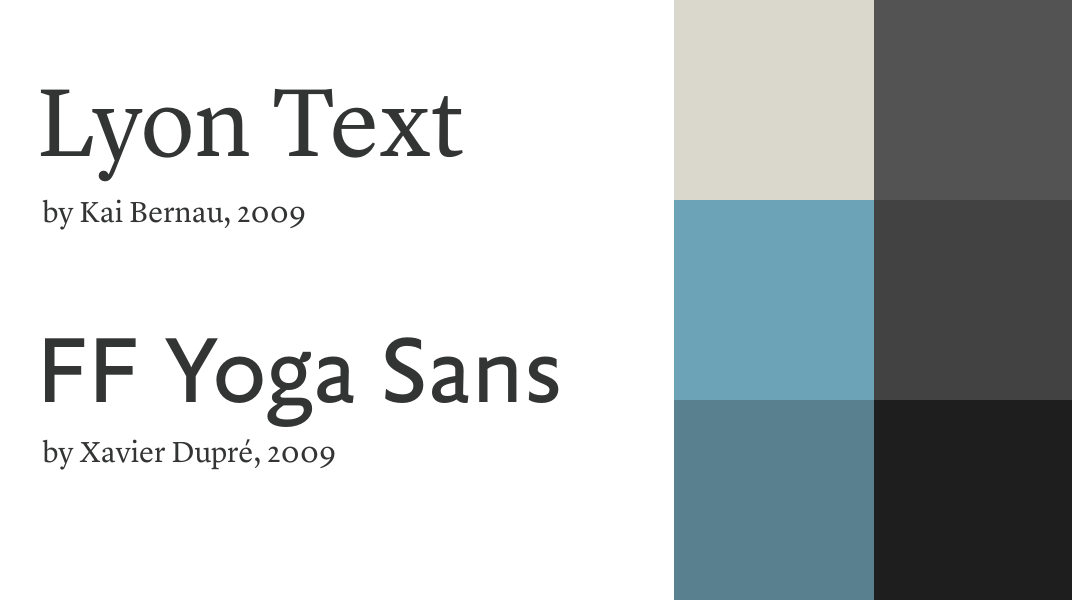
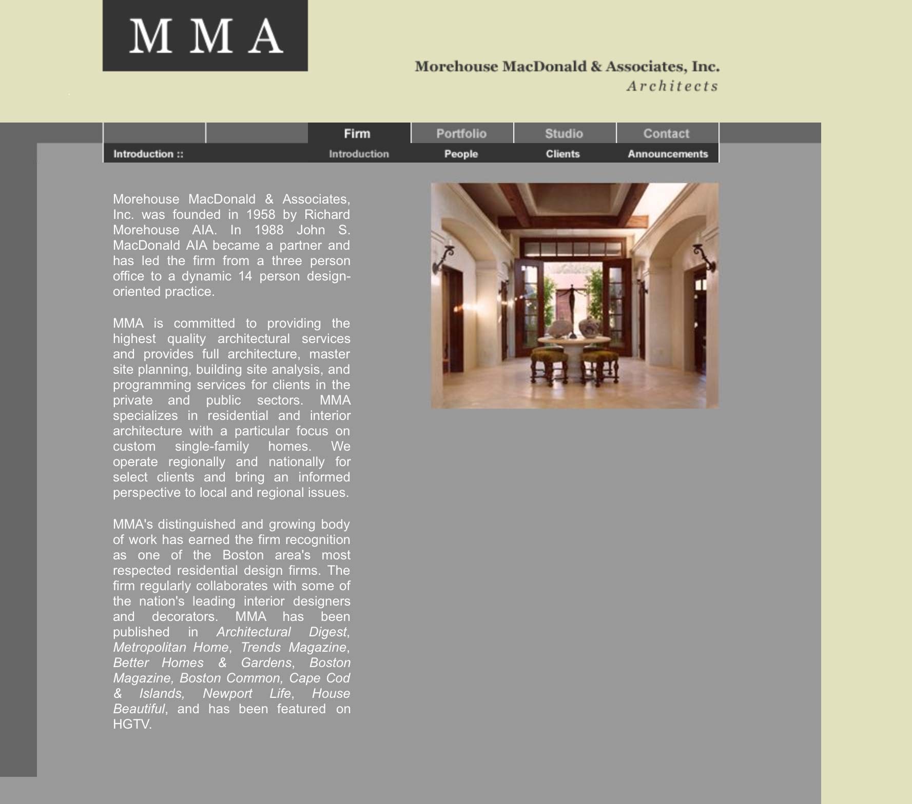
The old site was aesthetically dated and built in a format designed for much smaller monitors. We started the fresh design looking at base layouts, typography, and color palettes to work within the structure of their existing branding. The typefaces chosen for the site are Lyon Text for headings and body copy and FF Yoga Sans for supporting text.
The homepage serves as an introduction to the company, their most recent projects, and persistent contact information in the footer helps reduce the friction of getting in touch with the firm. Individual project pages are headed up a carousel of very large images showcasing the firm’s gorgeous works followed by a project description, and meta elements associated with that project. The imagery and decoration was kept to a minimum to allow maximum focus on the content itself. We wanted the site to support the work Morehouse MacDonald is doing and not distract from it.
Responsive & Social
The new MMA site is accessible and designed for any device. Using media queries and a flexible grid, we implemented a responsive site that delivers a great browsing experience for not only desktop browsers, but also mobile and tablet devices.
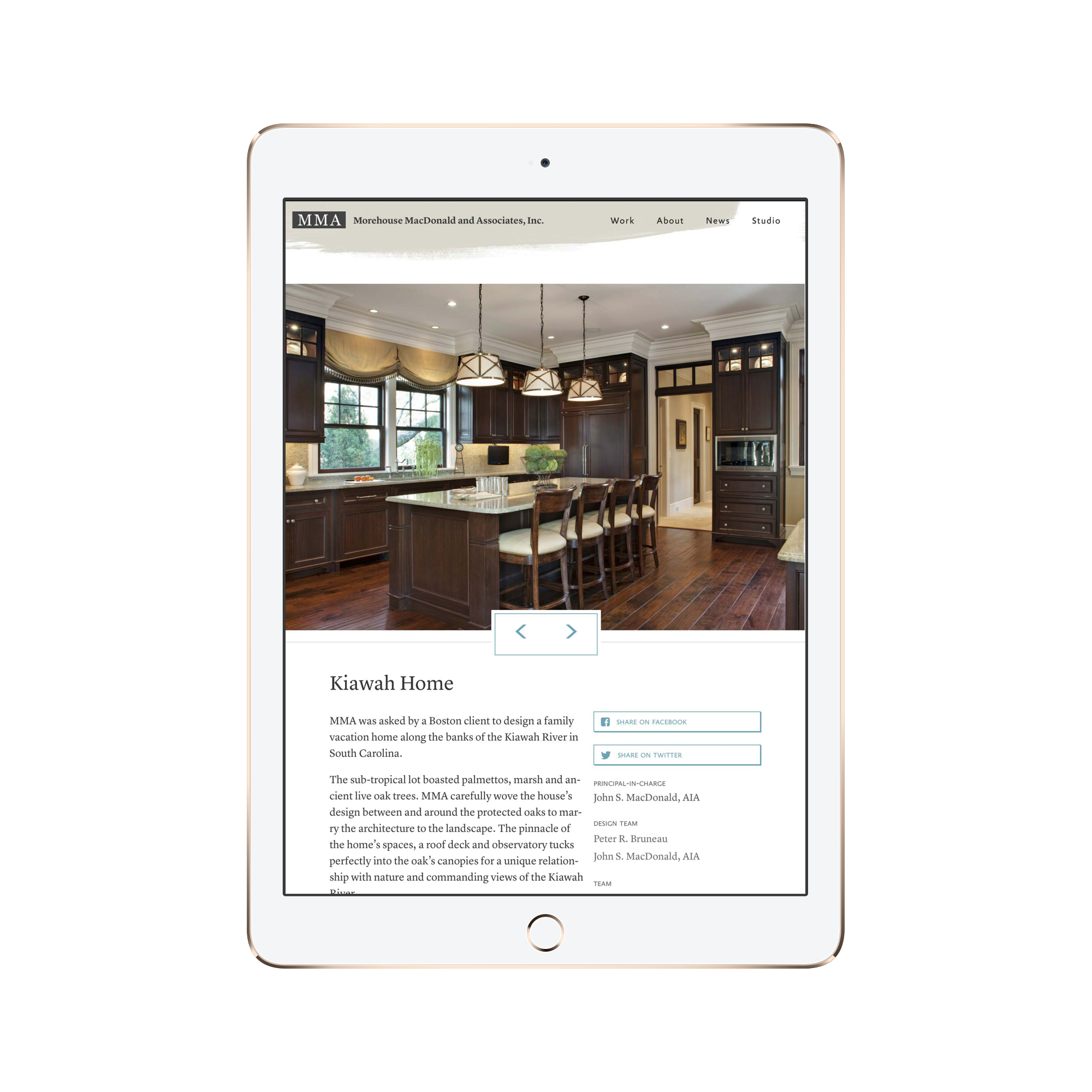
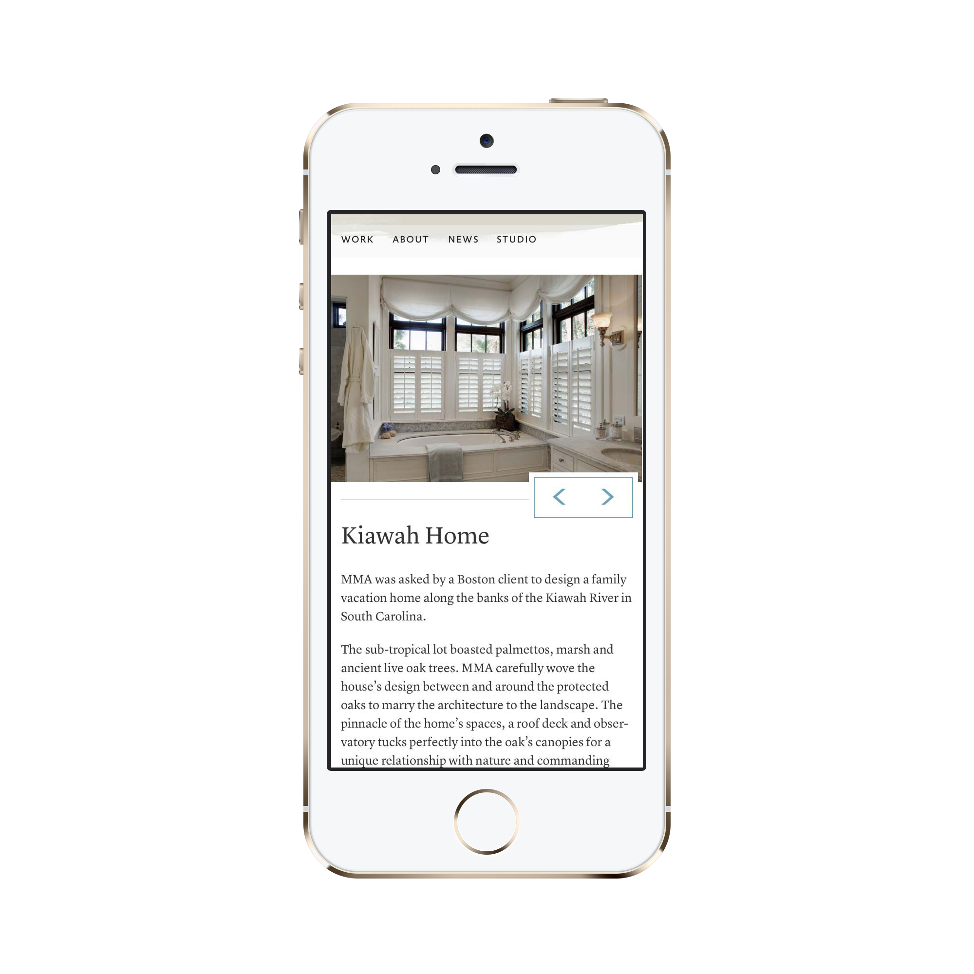
MMA’s prospective clients are coming to the site from the device they have with them – browsing is no longer restricted to the desktop. The site gracefully adapts for mobile devices; the content doesn’t change, it’s just formatted appropriately for the device being used.
We utilized our own Social plugin to handle broadcasting of blog posts and the pulling in of comments from outside social media. The individual projects are also equipped with the ability to share to Twitter or Facebook.


