After attending a conference where other universities touted the benefits of using WordPress to manage their website, the Colorado Mountain College team began hunting for the right partner to leverage WordPress as a content management system. Insert Crowd Favorite.
We needed to move our main website from a dysfunctional platform, and we needed to move quickly. Crowd Favorite assessed the situation and responded with a comprehensive plan to build out a new WordPress site, then scrape content from our 900+ pages and migrate it to WordPress. Communication throughout the project was clear and thorough (Sandy was great!), giving us opportunity to refine the project as we went. The launch went well, with no drop in visits or user engagement during our critical recruitment season. Doug Stewart, Marketing & Communications Director, Colorado Mountain College
Content Migration
It was clear that the previous site was difficult to manage due to a confusing content management system workflow with big limitations in what content could be included and edited. For instance, ‘portlets’ were chunks of content that appeared on every page, but were managed in a different interface than the main page content. Additionally, it was unclear if you were in the production site, or the staging site when editing content. Given the pain points, we knew that the versatility and flexibility of WordPress would be a good fit. But before we could leverage any of the great existing WordPress tools (or build new ones), we had to get the content out of the old system. This was a challenge all in itself. The previous site data was stored in a Liferay system. There was no good way to export the data and determine the content organization structure. We’ve run into this situation before. In fact, we’ve seen it so often we built a tool to handle it called WP Scraper.
WP Scraper is a tool for importing content from other systems into WordPress. It is based on our Oxygen PHP application framework.
It first crawls a website to generate a list of URLs to scrape (with configurable white and blacklists). Then we define how the content on the page should be mapped to WordPress’s data structure by providing a set of CSS3 selectors (think jQuery for matching a set of elements in a document) to target the appropriate bits of the page.
Once the scrape(s) are complete, it produces a report and WordPress WXR files for import.
We successfully scraped the content from the live site, but that was just step one. As we tried to import the scraped content, we ran into challenge after challenge. For instance, there were a number of dynamically called images and files — links generated from queries to the database versus static content. The WordPress importer is not built to import images with URLs that don’t have file names. To get around this, we modified the WordPress file importer to grab these images and files using GET parameters to spit out the document / image. The importer now identifies the file name from the HTTP headers instead of relying on the file name in the URL. From there we found a number of content items (articles) reused on multiple pages and in multiple locations within pages. Duplicating the content across the site would require significant editorial effort long term and introduces a lot of opportunity for human error.
Can you imagine making the same change over and over again, across hundreds of pages? Let’s hope no one wants to swap out the Facebook icon or change the contact email address.
We needed to make sure these items were flagged as re-useable content. We updated our scraper tool to properly identify when a section of the page is reused on other pages versus when it’s not. From there we were able to pull out the ‘reused’ chunks of content and provide an administrative tool for making edits in one place and have that populate across the site. But let’s not get ahead of ourselves… While we were handling duplicate text, we went ahead and targeted duplicate images as well (there were a lot). We captured the duplicated images used throughout and built the theme to properly deliver those (using a sprite) without having the same asset loaded by different files throughout the site. There were also a number of inline styles and scripts in the export that required additional attention before we could import everything.
Inline styles and scripts are specific to the element on the page. So for instance, if you have inline styles specifically applied to the header of the ‘About’ page (eg font-size:21px; text-align:center; font-weight:bold), those styles can’t be leveraged on any other page on the site.Now your ‘About’ page title will look different than the ‘Admissions’ page title, unless those same exact styles are manually put in on the ‘Admissions’ page. That’s a lot of manual work! Instead, we prefer to use CSS classes (eg class="entry-content") where the styles are defined in one place and are output anywhere that class is used.
With the number of inline styles and scripts used, it was unclear what the implications of keeping or removing these would be once imported. In particular, the style blocks proved to be challenging because their order and position within the content is important, including when they’re outside the body (which is what we had with this situation). We worked with the client to determine what needed to be retained and what (consistently) needed to go, and we stripped out what we could. For instance, there were inline styles around the image header placement, how it should be aligned and the spacing around it. We were able to specifically target this style block and remove it; knowing that we would be later coming through and applying appropriate classes for outputting the image header just as desired.
We even built a solution that uses the parent page’s featured image to populate the header. If the parent page doesn’t have a featured image set, the header image reverts to the one set in the theme by default. Ultimately we couldn’t convert everything; the legacy content wasn’t created with this approach in mind. We got most of it taken care of but had to leave a few things as-is in order to stay within scope. Pragmatism won the day here.
Design
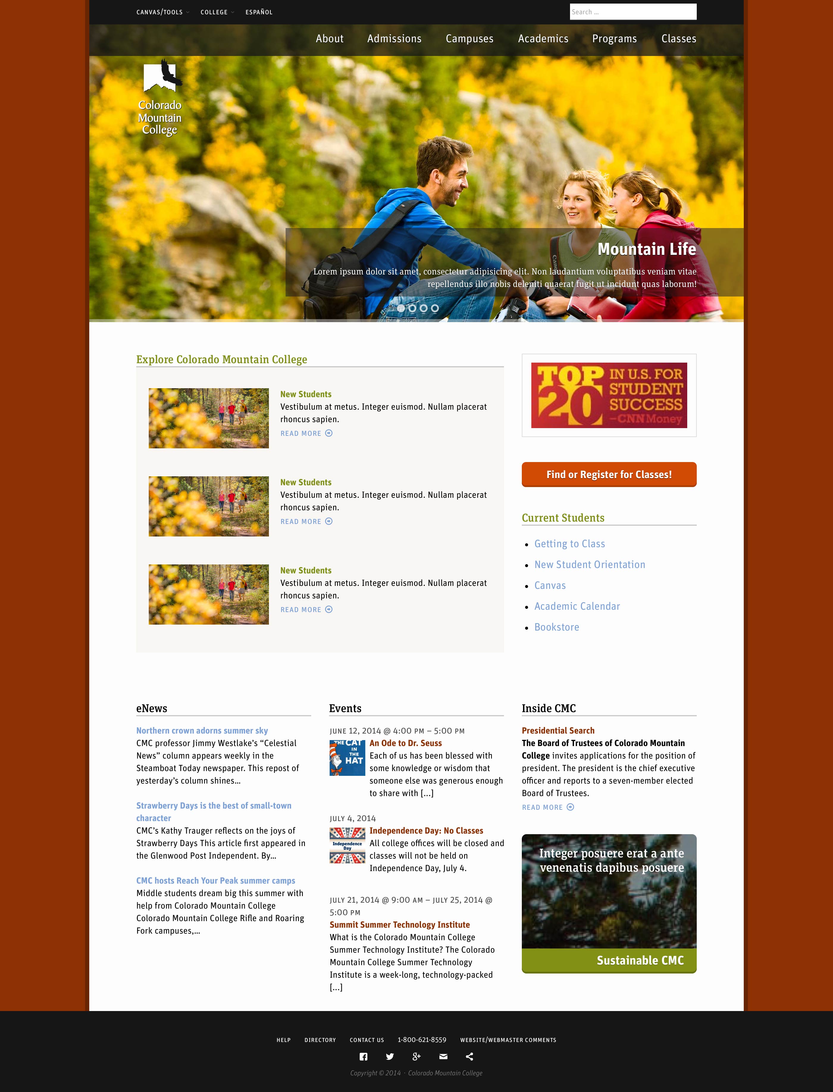
The Colorado Mountain College site had recently been redesigned prior to working with us. They wanted to retain the new look and feel, make it work on mobile devices, and completely reorganize the homepage.

The new homepage layout helped direct the various users (prospective students, parents, current students, faculty and staff, and so forth) to the areas of the site that are important to them. For the new homepage, the design is focused around:
- A carousel of rotating options to highlight the quality education CMC provides in an idyllic atmosphere
- An “Explore the College” section that helps users dig deeper into their areas of interest (ways to dig deeper into the site based on your interest)
- A link for students to search and register for glasses (large actionable item)
- Fresh news content
- An events calendar
We put together a few layout options that would each work scale to work across tablet and mobile devices, while integrating with the existing page template design. With some additional refinement around style preferences and brand messaging, the client decided upon had a sparkling new homepage design.
A new way to get around…
The new home page was designed to work across all devices – desktop, tablet, and mobile. But now we had to get the rest of the site to do the same.

We typically create a responsive site from the ground up. This allows us to make decisions along the way to make mobile compatibility easier. Making an existing page design and making it responsive is a different challenge entirely. Since the goals of a site and its content can be different on desktop/tablet than on mobile, we worked with CMC to devise a strategy upfront. We learned what they thought was most important to present, and to who. And then we mapped that back to presentation. Yes, it’s a content-first approach to design even with an existing design.
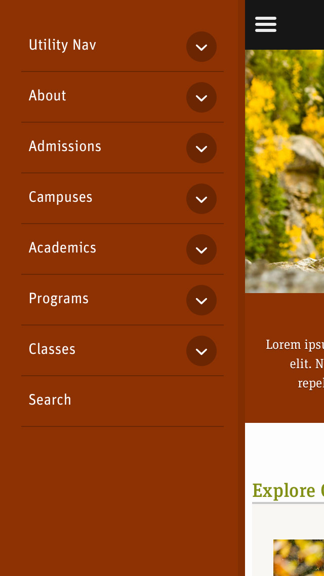
We’re a big fan of this because it works! The biggest concerns revolved around navigation. As with any university, their site must satisfy a number of different types of users (students, prospective students, parents, faculty and staff, vendors), each with their own that have very different content demands. The navigation was refactored to provide mega menu style options on desktop and tablet views, and a nicely collapsed menu for mobile. The mobile menu retains the menu groupings, and uses an accordion effect to open and close the various different top level menus. From there, the existing page template design was tweaked to work on a grid, and then integrated into our a WordPress theme, powered by our Carrington Core template engine.
Snippets
Remember how we had all these bits of content used in numerous places with the content migration? We eliminated the duplicity, but had no way to manage these. To provide an editorial management tool for these reusable things, we employed an internal tool: the CF Snippets plugin. This plugin gives editors the ability to create chunks of content (including HTML content) to be inserted pretty much anywhere on the site with an easy-to-use admin interface. This functionality allows these users to custom-curate the site display, without editing the codebase.
The WordPress admin interface for CF Snippets provides editors with an easy way to edit content in one place that is then displayed throughout the site. And isn’t it great when one solution fills other requirement needs? We use CF Snippets in a few other ways. Each dropdown in main navigation, is a mega menu with a third column call-to-action that needs to be editable. Leveraging default WordPress menus, we generated the first two columns of dropdown navigation, and then added a snippet for the third column. Additionally, the “Explore Colorado Mountain College” section of the homepage needed to be flexible enough to point to any content, even linking to an external website.
Using snippets, the editorial team can custom-curate that area on the homepage without any need to touch the theme files. We’d typically use Carrington Build to make the entire home page configurable, but in this situation, expedience was more important than the additional capabilities. The left sidebar navigation menus can also employ snippets, while still allowing for full editorial control using WordPress native menus; snippets provide a handy extension. The way snippets are used in this context, the client is empowered to make the necessary CSS/HTML revisions from in the dashboard versus directly in the code.
Conclusion
We were tasked with the goal of reestablishing the Colorado Mountain College website on WordPress, while also polishing up their web presence; within a limited budget. This can be a tall order, especially if robust, all-encompassing solutions are necessary. Rather than drop features from the list and provide a less-than-desired final product to meet the budget demands… we worked with the client to scope the work effort to make the most of the available budget. Not only did we get the content successfully migrated, we offered pragmatic recommendations to ultimately achieve all the outlined business objectives including a few wish-list items. At the end of the day, both our team and the client were pleased with the result.
Working with Colorado Mountain College on their new site was a great experience for us. They clearly outlined not only the high-level goals for the new site but also the reasoning behind them. With these goals in mind we were able to work together on creating long-term, maintainable solutions. Colorado Mountain College understands the diverse set of visitors to their site and we worked with them to make sure it was particularly well suited to prospective students, current students and parents. We were able to define a custom experience for each without sacrificing consistency and creating an overly complicated website.
We feel privileged to have been a small part in creating a stellar web presence for one of the colleges here in Colorado.


