The way browsers handle canvas drawing on HiDPI (or Retina) displays is a bit of an unknown specification. The common assumption is that because canvas uses vectors to rasterize its entities like lines and shapes, it should “just work” for HiDPI displays. This assumption is currently incorrect and leads to inconsistent results across browsers. To try and sum up the technical issue at hand, this is Paul Lewis writing about this for HTML5 Rocks.
… This means that if you draw an image into a canvas in Safari it will automatically double the dimensions of the image when writing it to the canvas’s backing store, so after scaling down to the logical pixel size and back up again through the devicePixelRatio you will arrive back at the size you specified. In Chrome, however, the image will be written to the backing store at the exact size you specify which means that after the devicePixelRatio is applied it will be upscaled and blurry.
In short, Safari automatically handles this issue, upscaling your canvas work to appear at retina quality, while all other browsers currently do not. In the article he describes the correct way to approach this problem in writing your own canvas code, but what happens if you’re using a vendor library that does not account for this problem? Do you edit the vendor’s source attempting to correct it? On this site we’ve chosen to use the FF Chartwell font to render our graph displays as seen on our services page.
We found ourselves in this exact position in using FF Chartwell as they do not account for HiDPI displays, and the cross-browser issues it presents. In contemplating this problem, we came up with a solution that would handle these cross-browser exceptions without having to edit the vendor’s source. Using JavaScript’s inherent (over?) flexibility, we were able to modify the core behavior of HTMLCanvasElement and CanvasRenderingContext2D to produce a cross-browser HiDPI friendly result without the need to modify the vendor source. This is the pattern we used to extend the core functions, commented for clarity.
https://gist.github.com/jondavidjohn/7791785
As an example, we’ve extended the native Array object type to run a bit of custom code whenever .join() is called. First, we use this pattern to extend the HTMLCanvasElement's .getContext() to increase the real size of the canvas to match the screen’s pixel density, and then scale the display size to what expect on the screen via CSS. Similar to how you would display 2x images for retina compatibility (view source).
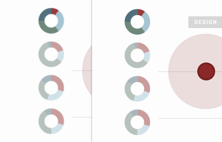
Now that our canvas is scaled appropriately, we also have to scale our drawing dimensions. Using the same pattern as detailed above we extend each drawing function to multiply specific arguments to match the increased canvas size due to the pixel density. In most cases all of the arguments are simply multiplied by our calculated pixel ratio (view source). Here you can see the difference before and after we apply the module.
 Also, this module is smart enough not to scale Safari, or any browser that follows the Safari scaled backing store implementation.


