


(Click for larger versions on Flickr)
I sent them over to Michael with a brief note:What do you think of this as a concept? It would work great as a responsive site (mobile happy) and would really put the focus where I think it should be – your awesome content.The response I got back was encouraging:
I f*****g love this concept.We continued to chat about various details, and decided to go forward with the following process:
- wireframe revisions
- hi-fi design review/feedback
- build a WordPress theme
- help migrate content from Movable Type
The Device You Have With You
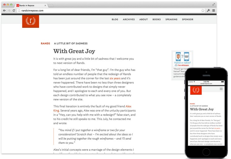
Borrowing from “the best camera is the one you have with you”, we wanted to make sure that the best device for reading Rands in Repose was the one you had with you. [services class=”pl1″] We set up the design with several breakpoints. Text resizes, margins and the header adjust appropriately to provide a great reading experience. Granted it’s a small sample size, but I find I’m now choosing to visit the site to read new posts instead of staying in my feed reader (like I did previously, especially from my phone). With mobile in mind from the beginning, it definitely shaped our design approach. Content consumption is increasingly done on mobile. Modern website design needs to account for this.Archives
The initial attempt to put the archives on the home page didn’t work too well – it made the home page too heavy and it would only get worse over time. We ended up with three different special views:- Home Page: just the latest long-form article, with full content, sans comments.
- Blog: excerpts of each long-form article as well as link posts.
- Archives: the search form and a list of all long-form articles (with title, date and category).
When Alex mailed me with his ideas for wireframes in July, I had no credible plan to launch a new version of Rands, let alone a modern, mobile-friendly site that not only provides creative options for the future, but also excavates over ten years of content buried in the archives. Michael LoppRands in Repose
Measure Twice
Over cocktails in the bar at the Wynn in Las Vegas last month, Michael told me (somewhat sheepishly) that he’d “taken the last few weeks and re-examined every decision we’d made” when putting the theme together. This is exactly what should happen. The site is his, the design and theme implementation was our attempt to put together a site that would properly support his content and online identity. It made it all the more satisfying when he proceeded to add “…and I independently came to the same conclusions you did.”Instagram and Twitter Integrations
The footer is the standard “meta” area. There are some additional navigation links and micro-integrations with Michael’s social network presences: Twitter and Instagram. For Twitter, we kept is simple and styled the default Twitter JavaScript widget. This shows the latest tweet from @rands.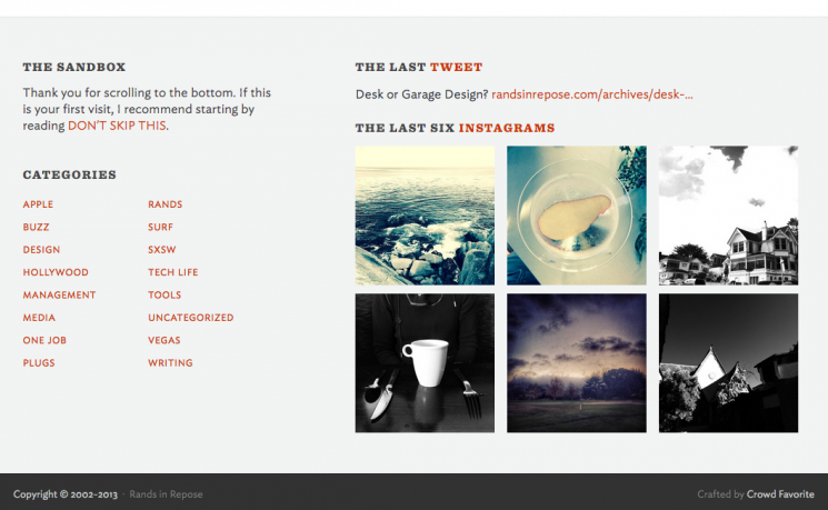
The Instagram images are a touch larger than the standard thumbnails you see on a site – they are a size that makes the photos actually distinguishable. Crazy idea, I know. Here’s the thinking: if it’s worth putting on the site, it’s worth presenting it at a size appropriate for that content. The larger size definitely grows on you.At this point it's easier to write the damn thing myself. #wordpress #plugins
— Alex King (@alexkingorg) August 16, 2013
Baggage
When you’ve been publishing online for a decade or so, it’s somewhat important to make sure that existing content continues to work well in the new site design. We, Michael, and his readers would have been pretty hacked off if the existing content we all know and love wasn’t treated right. Luckily, importing content from Movable Type to WordPress is a pretty well-known problem. We had to make a few changes to the default importer to handle custom fields and formatting issues, but overall the import was very straight forward. We updated the URL structure of the existing posts to a more terse, modern syntax. Before:randsinrepose.com/archives/2011/10/11/the_rands_test.html
After: randsinrepose.com/archives/the-rands-test/
Happily, the previous URL structure was consistent. This allowed us to handle the redirects with a simple pattern match. We also redirected the categories, the RSS feed, etc..
Google picked up the new URLs just like it’s supposed to.
3… 2… 1…
As we got closer to launch, we did another solid round of second-guessing and fretting about all the details.- Would people like the new design?
- Was the header navigation right?
- Can we tweak this one last thing?
- Would the existing server handle the new application profile?