Challenge
Intended as a temporary solution, the existing Naked Mobile site offered limited functionality and a convoluted user experience. Furthermore, the company’s advertising campaign at the time hadn’t tested well among audiences.
Solution
Crowd Favorite first helped Naked Mobile to refresh their look and feel using custom typography and graphics, paired with new imagery and focused messaging. We then overhauled their site for a friendly, seamless customer experience on both desktop and mobile devices.
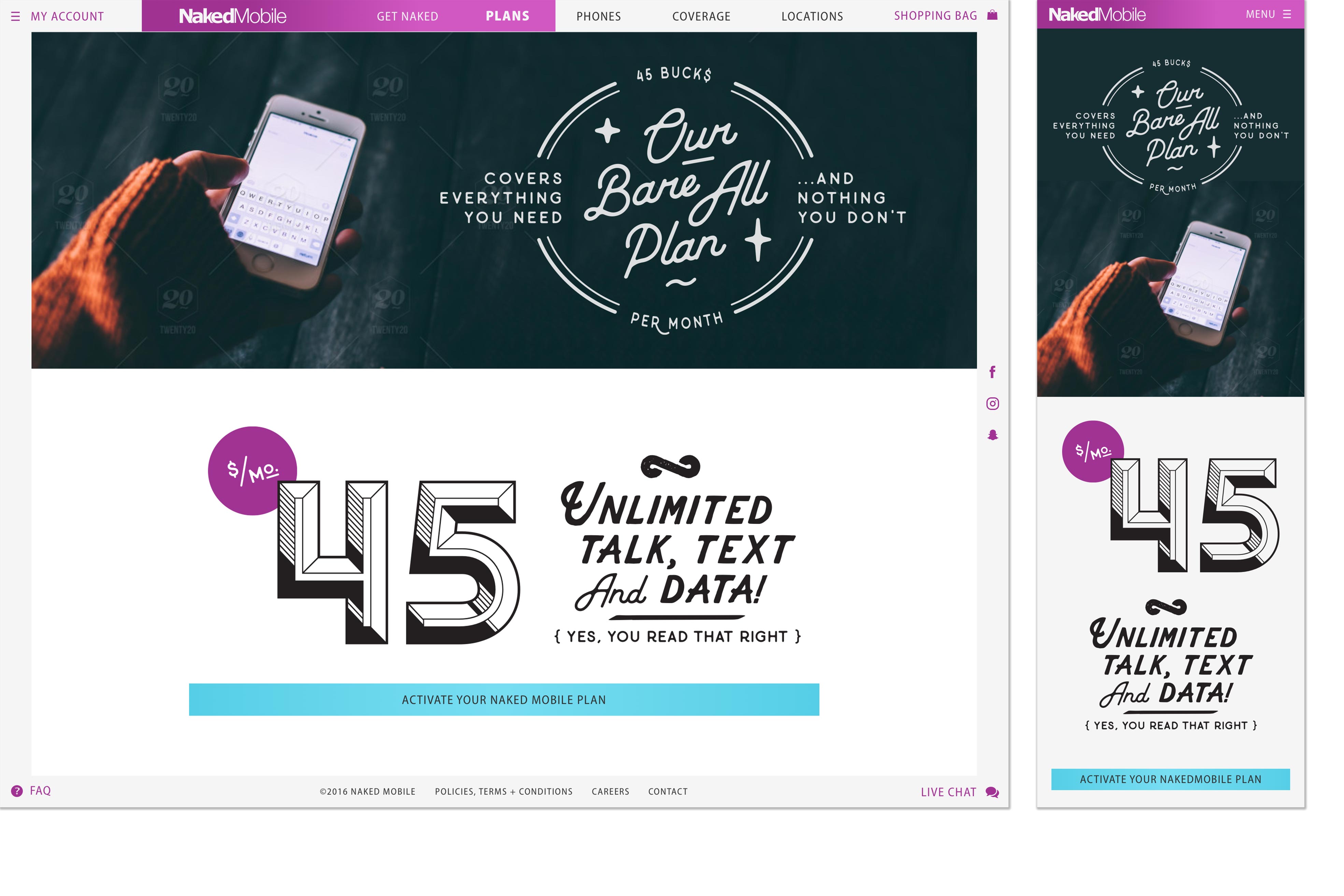

Naked Mobile, a subsidiary of Cellular One, is a wireless provider serving the Southwestern U.S. The company, which targets budget-conscious shoppers (such as college students and retirees), offers a small selection of flat-rate plans, promising their customers simplicity and transparency above all. Unfortunately, their existing site hadn’t been built to deliver a straightforward, successful customer experience.
Naked Mobile’s site at the time had been intended as a temporary solution. Its functionality was limited, and for their customers, the purchasing path was convoluted. Naked Mobile engaged Crowd Favorite to design and develop a modern, user-friendly site that would deliver on their promise of simplicity and transparency. But that wasn’t all.
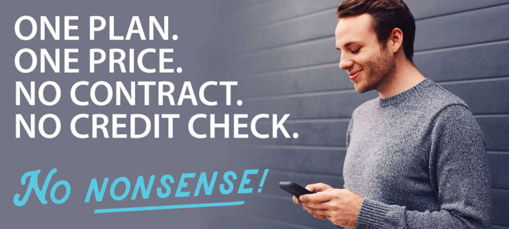
Naked Mobile had another challenge: Their most recent advertising campaign, a cheeky campaign that played on implied nudity, hadn’t tested well among audiences. They needed help to establish a look and feel that would resonate with millennial audiences, who crave transparency and are wary of gimmicks.
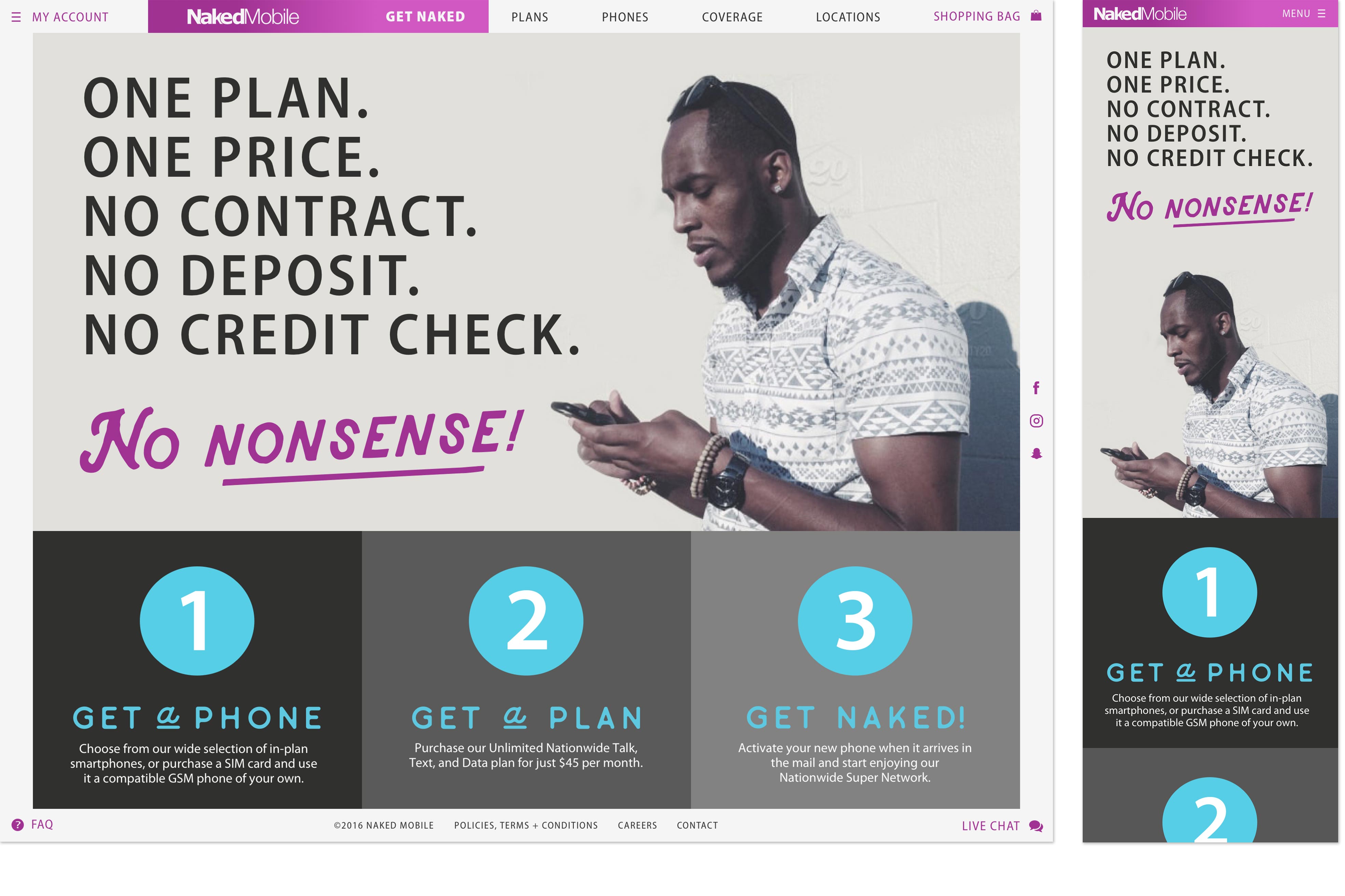
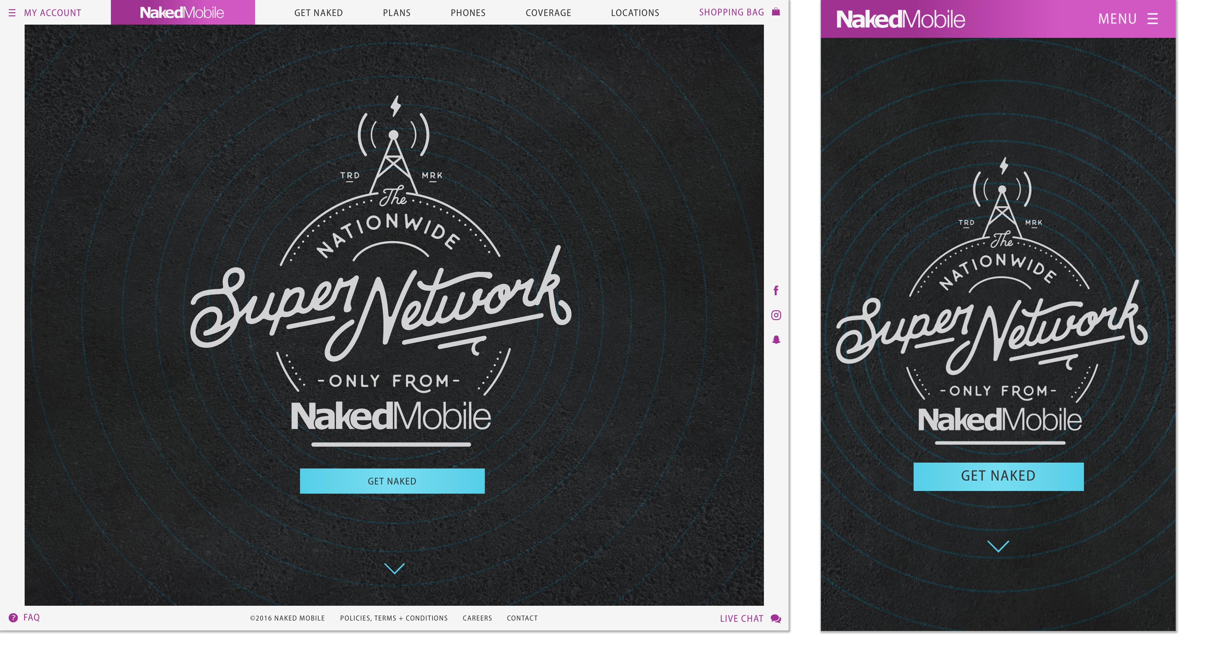
Crowd Favorite first helped Naked Mobile to refresh their look and feel using custom typography and graphics. We chose hand lettering, paired with authentic, vibrant imagery (as opposed to traditional stock photography) for a natural, accessible, and energetic feel.
While we loved the concept of a single-page layout as a way to reinforce the simplicity of Naked Mobile’s product offerings, we also knew this approach would present challenges, such as SEO limitations, content restrictions, and longer load times (particularly on mobile devices). Instead, we developed a multi-page site with custom-coded page transitions that make the site feel like one page, but without the aforementioned limitations.
Having built the site to be experienced as a single, scrolling page, we didn’t want users to have to scroll the length of the site to reach links typically housed in the to navigation or footer. Our solution was to build a 40-pixel fixed frame around the browser view (referred to as the “information panel”) that works like the dashboard of a car. This panel makes key navigation available to users at all times, regardless of where they are on the site. We also developed an expanding promotional panel, visible only during one of Naked Mobile’s flash deals, which locks to the top of the browser, so it’s the first thing that site visitors see.
We engineered the site to automatically fetch and display the most current selection of phones available for purchase, requiring no effort from the Naked Mobile team. And with the site built on the user-friendly WordPress platform, editing and adding site content is easier than ever.
All in all, the completely rebuilt site delivers a simple and intuitive customer experience, seamless on desktop and mobile devices alike, along with easy-to-use content management tools, and the flexibility for Naked Mobile to scale, modify, and make enhancements for years to come.

