


With nearly half of Americans planning to visit an amusement park within the next year, parks have a big opportunity to bring in business through website traffic. The following list of best practices can help to bring focus your site, ensuring it serves your visitors, captures their imaginations, and makes your park the obvious choice.
Brand and user experience
Maintain a cohesive brand
Think of your website as an extension of your park, it should stick to your brand in terms of visuals, voice, and objectives, and reflect the park’s personality. Your site should be planned and executed to provide a seamless experience between the digital and physical aspects of the park.
Cater to your guests
As part of the hospitality business, amusement parks, and their websites, should take extra care to cater to their visitors. Prime focuses should be on meeting customer needs and extending the same warm welcome to an online visitor as they would receive in the park.
Tell your story
Entice prospective visitors with storytelling. Communicate why your park is the right choice and provide an experience tailored to a visitor’s particular interests. Spark the imagination of your future guests and allow them to see what their park adventure could be.
Through interesting visuals and energetic language, make the park come alive. Use that first split-second impression to make a lasting impact. Instill your future guests with positive feelings and provide anticipation for excitement before a guest ever steps foot in the park.
Design and architecture
Be clear with the site’s design. Provide straightforward options that allow the user to navigate easily to what they’ve come to the site for. If too much content is competing for attention, it makes it difficult for users to find their way.
Clarify calls to action
If your visitors are confused, you risk losing their business. Resist the temptation of visual noise and distraction, and instead provide simple, easy-to-identify calls to action. Plan these action items judiciously to avoid overwhelming the user.
Hershey Park, for example, has done a great job of clearly designating their primary calls to action. The rest of their content has been organized into two main menu bars that make the options easily identifiable.
In contrast, Busch Gardens Tampa has a variety of competing content that makes it difficult to discern what’s most important. To add to the visual chaos, there’s a total of four main navigation menus. Add to that repeated content between menu and callouts on the page, and it’s easy to see how a visitor could become confused.
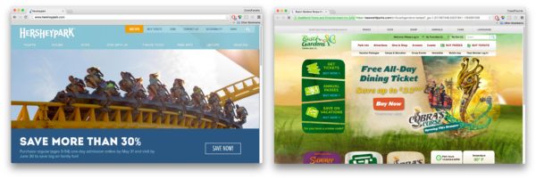
Busch Gardens’ primary call to action is the red “Buy now” in the middle. All other content competes for attention. Some of this additional content appears to be repeated, for example: “animals” and the different calls to action for tickets.
Avoid hiding content in sliders
A common, but ineffective web pattern is to house many pieces of important information in a rotating set of slides. This might be a convenient design solution for squeezing all sorts of information “above the fold” on the homescreen, but most visitors will never see past the second slide—if they see the second slide at all.
Instead, determine the most important message to highlight and allow the remaining content of the site to be easily found in navigation or in a dedicated section below. The popularity of scrolling sites has influenced behavior and users now instinctively scroll to find more information. Additional important marketing messages can be placed “below the fold” and still be discoverable.
Be a ruthless information architect
If you only take one thing away from this list, it should be the importance of properly organized content. Clear and easy to use navigation is a must. Create an intuitive path for your visitors to effortlessly find what they’re looking for.
Visitors to your site are usually are in search of specific information. Logically grouping menu items into categories allows you to guide the flow of visitors and help them find their way. Reducing complex ideas to simplified content groups and well-labeled, high-level navigation items makes finding things easy. For example, under a main menu item titled “Tickets” you might expect to find anything from ticket prices to packaged specials to gift certificates. Everything relating to ticket sales could be found in that category.
Standards of web practices
Responsive mobile design
Users today expect sites to be optimized to work on mobile platforms, as well as desktop. Ideally, your site should be device agnostic and work on a new laptop or a four-year-old cell phone.
In favor of responsive design, Google boosts the ranking of mobile-friendly pages on mobile search results saying “if your site’s pages aren’t mobile-friendly, there may be a significant decrease in mobile traffic from Google Search.” Don’t miss out on traffic because your site isn’t responsive.
It’s also important to pay attention to web development trends, and make an effort to stay up to date. Flash was a standard for years, but has since lost its popularity because it isn’t mobile friendly.
Focus on a fluid mobile experience
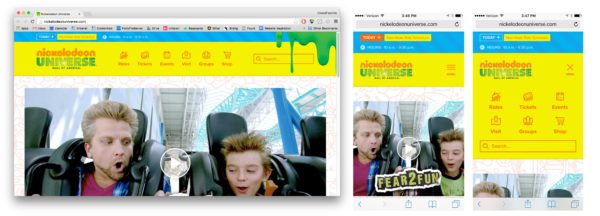
Mobile content presentation should be simplified, but ideally, still have all of the content that’s available on the desktop. Ensure that clickable content is large enough to easily be selected by thumbs and fat fingers. Nickelodeon Universe does a good job of this.
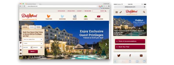
Another good example is Dollywood’s site, which transitions elegantly from desktop to mobile:
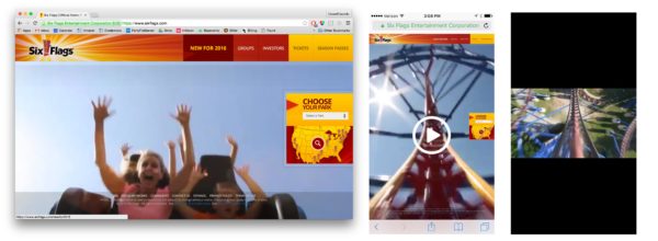
Mobile responsive behavior can be tricky if not properly addressed. Six Flags’ homepage is well executed on desktop, but transitions less gracefully to mobile.
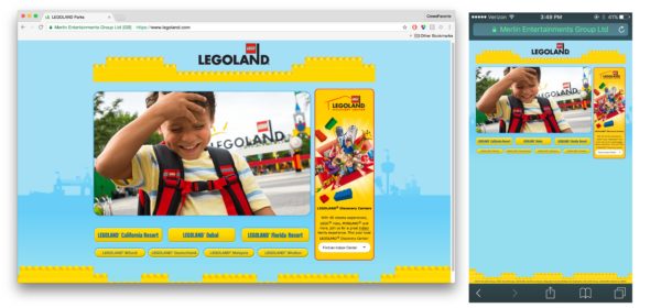
And you don’t want to force your mobile user to start a pinch and zoom scavenger hunt, like Legoland’s website.
Need for speed
Users aren’t going to wait for a page to load, so speed is also a priority. “Customers are won or lost in one second,” an Aberdeen study found. Forbes talks about how a slow website can “kill your bottom line.” As internet speeds get faster, users become more impatient and expect faster performance.
Choose effects wisely
Save the flashy effects and thrills for the park’s rides. Radical departures from traditional web conventions can be alienating to audiences. Fun and ornately animated sites aren’t inherently bad, but the first priority should be to make your site intuitive and easy to use.
By following standard navigation and site organization conventions, you allow your site to be familiar and easy to maneuver. Use your content, photos, videos, and voice and tone to inspire and delight your visitors. We’ll touch on how to delight users more in a minute.
Make it accessible to all
Web accessibility is as important in the digital world as it is in the parks. Web Content Accessibility Guidelines (WCAG) are general standards that help ensure a site is useful and accessible to everyone. For example, it’s best practices outline how to make your site legible, even to those with color blindness.
User testing and audience research
Do you know your users and what they want? If you haven’t already done so, conduct some research. Ask actual users for their feedback. What can you do to make things easier for them?
Consider use cases
Keep in mind you have a variety of users, all with the potential to become customers. Visitors might be browsing park offerings, deciding whether or not to visit, planning a trip, looking for deals, making arrangements, researching their particular interests (kids, coasters, food, etc), making purchases, buying tickets, booking accommodations.
And once they’re in the park, website users might be in line planning their next ride, looking for a map, directions, or where to go for lunch. Consider these use cases and how your site might accommodate them.
Have users go through a purchasing process to uncover potential sources of frustration and reasons for abandoned shopping carts. Making information easy to find can help alleviate the load on your customer support phone lines.
Observe your users
It’s important to run usability testing and to watch actual users interact with your site. Host a test, live or virtual, to see how participants navigate, search, and use your site. This will illuminate things that have been overlooked or disregarded. As experts in your park, familiarity and in-depth knowledge can lead to false assumptions about your audience. User testing provides valuable insight into the realities of your user base.
Additional considerations
Leverage social media
How strong is your brand’s social media presence? If these channels are active, consider building a site that accommodates and highlights your activity. This is only advisable if your channels are actively managed, otherwise, you risk clogging your site with rarely updated social media content.
Content management system
A custom-built content management system (CMS) provides the flexibility to make updates as-needed and allows for easy website editing by non-technical users. WordPress, a powerful and secure platform that is easy to manage and optimized for SEO, is a good choice. Before building, consider whether forms, maps, calendars, galleries or other types of content will need to be part of the site, and who will be responsible for editing and updating them.
Employee portal
Determine if you need a dedicated employee portal for staff to sign into. This could be a place where employees set up a profile, check their shifts, or access gated company information.
App
If, on top of a mobile-friendly website, you need an app, it should provide an additional and distinct benefit over the site.
Perhaps the app has downloadable maps that can be accessed without cell service or wifi. For those looking to streamline their park experience, you could have interactive, customized maps with the ability to route plan and check off completed rides. It could allow for user accounts that save personalized information. Gamification could help increase interaction with certain aspects of the park. The possibilities for app features are endless, just be sure to do some user testing before you get too far along. If your audience doesn’t find your features useful, it’s useless.
Animation
Animation is a powerful tool for enhancing the user experience. Subtle, thoughtful animations can go a long way in delighting your users and elevating their web experience. We provide some examples we love here.
Ultimately, the experience that users have on your site will directly influence their perception of your park. Focus on their needs, follow web standards, simplify navigation, and of course, user test, and don’t be surprised when those leads convert to customers!