Challenge
TEP’s lack of an effective content management system resulted in broken links and hundreds of pages of poorly organized content, leading to high bounce rates and frustrated users.
Solution
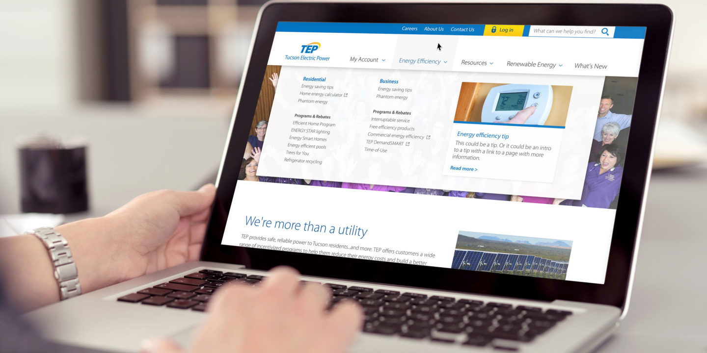
Crowd Favorite totally redesigned TEP’s site with clarity and user-friendliness in mind, overhauled the extensive site map and navigation system, and migrated the entire site to the WordPress content management system (allowing their staff to manage site content more efficiently than ever before).
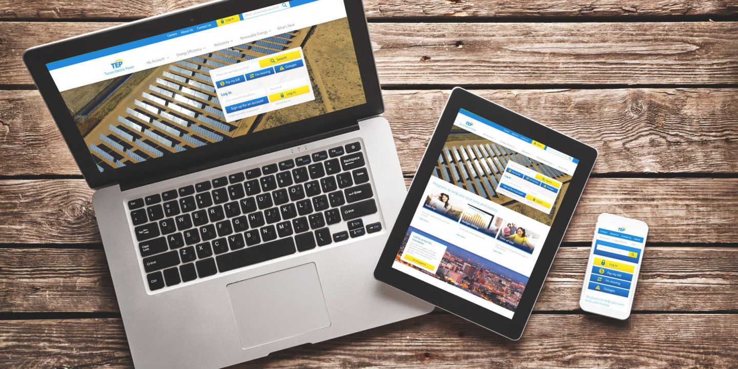
Tucson Electric Power (TEP) is a power provider serving nearly half a million customers in Tucson, Arizona. The company’s outdated corporate site was a hassle for their staff to maintain and a headache for their customers to use. The company came to Crowd Favorite seeking a complete site overhaul that would allow multiple team members to easily update content on a regular basis and provide an enhanced, seamless customer experience across a wide range of devices.
TEP’s site didn’t have a content management system, so all content pages on their old site were hard-coded. This presented challenges both for TEP’s internal team and for their customers. Without an easy-to-use content management system, adding pages and refreshing content were cumbersome and time-consuming tasks, which inevitably resulted in content not being updated as accurately or frequently as it should be. Over time, the site grew to hundreds of pages, many of which were inaccessible or obsolete. Overall, the site’s lack of consistency and focus didn’t align with the reputation for reliability TEP was trying to establish. Their customers had taken notice, prompting the company to take action.
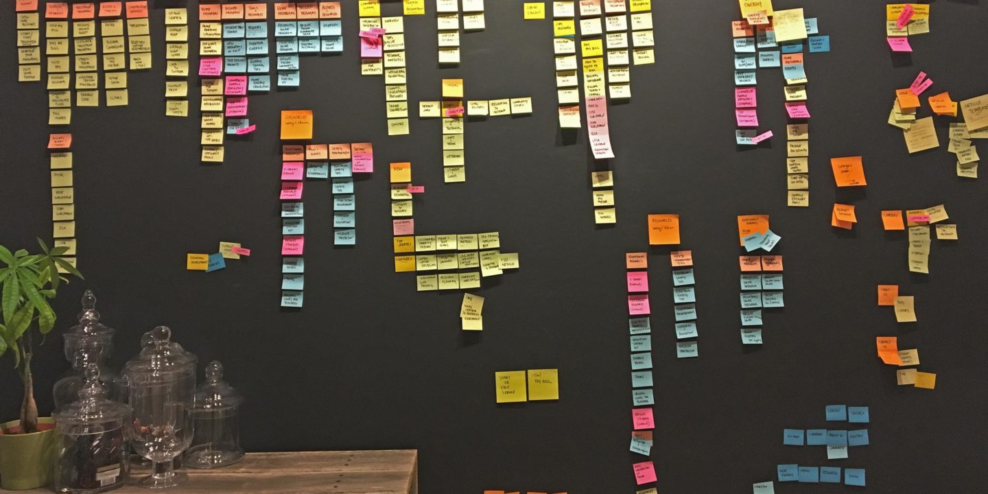
To pinpoint the architecture and design issues we’d need to address, Crowd Favorite conducted a heuristic user experience audit, evaluating the site against a list of nearly 250 established web usability guidelines and best practices. Based on our findings, we saw a clear need to reorganize and restructure the site’s content and messaging to refocus them on the goals of TEP’s customers (the core principle of user-centered design).
We redesigned the site in a way that helps customers quickly find what they’re looking for, but also to learn more about TEP (including their community outreach programs, renewable power initiatives, and company news) while they’re doing it. We also built custom social media feeds to encourage customers to connect with TEP on Facebook, Twitter and Instagram, giving them a platform to keep their customers updated and to educate them as well.
The look and feel of the site were based primarily on TEP’s brand standards, but also on established international standards regarding how to make content more accessible to people with disabilities. In meeting the requirements of both, we’ve built a site that enhances the TEP brand while remaining universally accessible to all users.
We built the new site on the battle-tested WordPress platform, which gives TEP’s staff the ability to add and revise content easily, make global changes, and generally keep the site fully up to date. And because TEP is a public utility with a customer database housing personal and financial information, we put stability and security at the forefront during our development efforts.
With their completely rebuilt, user-centered, mobile-friendly site, TEP can now offer its customers streamlined access to information and functionality for years to come.

