

We’ve all been there, an empty login form sneering at us from the screen, that pit in our stomach when we become acutely aware that we’ve forgotten our password. Or our username. Or the ultimate horror: both.
It seems everything online requires a username and password. The number of credentials we’re required to remember pile high, each with their own arcane requirements (“Username must be between 3-5 characters…”). While login forms haven’t changed much over the years, even minor design adjustments can significantly improve the overall user experience.
Facilitate the flow
Login forms are fundamentally an obstacle. They block your users from doing the thing they came to do. With that in mind, you can alleviate much of the pain of the login process by reducing the amount of effort required by the user to log in.
Autofocus
Consider automatically setting the focus on the login field so users can start typing immediately, without having to click on the input field. Tumblr is a good example of this.
Specify mobile keyboards
When filling out a form on a mobile device, there’s nothing more annoying than hunting for the right key. Take advantage of the keyboards specifically designed for mobile devices. Text, email, url, number, and telephone have all been optimized for the keys you would want in a particular situation. (Learn more about this here)
Embed the form
There’s no need to send your user to a separate page to log in. Reduce load time and embed the login form directly on the current page to eliminate the jarring jump of pages and streamline the process.
Allow multiple login options
Be considerate and allow your users multiple login options. Let them choose which they find easiest; maybe it’s email, phone, username, or even facebook. Since usernames aren’t always relevant to an application, an email is a useful alternative and has the benefit of being easy to remember. If it makes sense for your site, social media sign-in options such as Facebook and Twitter can make it painless for users already logged into these services to log into your site without having to remember their account details.
Additionally, if your site uses email in place of usernames, make sure to clearly label the fields to indicate the type of input required. As a user, it’s no fun when you can’t figure out your username because you never set one in the first place. If your application accepts either email or username, save the user from confusion and say so.
Remember users by default
Isn’t it nice to be remembered? Extend the courtesy to your users and remember them when they return to your site. Unless your application involves private data or financial records, it may make sense to leave users logged in by default, since public computer usage isn’t as common as it once was. If you have a “keep me logged in” box, you can have it checked by default. Or, if you’d prefer not to leave them logged in, consider at least saving their username so they only have to remember their password.
Streamline password retrieval
If someone has forgotten their password, don’t force them to retype their login to retrieve credentials. If they’ve already entered it, remember them.
Give hints
Additionally, it can be useful to provide context for a user who is having trouble remembering their password. A simple note of when it was last changed can be valuable. Or, to jog their memory, allow them to display a hint. In the midst of forgotten password, I know I’ve appreciated a reminder a time or two.
Clarify form submission
Once the form is completed, tell your user what that button does. “Log in,” “Sign in,” “Sign up,” “Join the club,” etc. provide more context than the vague and unfortunately ubiquitous “Submit.” Let the user know they’re being logged in or signed up, don’t leave them to make assumptions.
Access security
Is your site bombproof or is it useful? Any online service or application must find the right balance between security and user experience. Don’t get caught in the trap of building an overly secure site at the expense of the user experience. There are several little things you can do to assist your user.
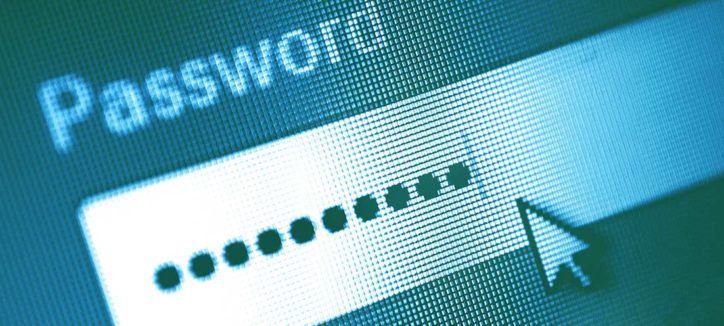
Show passwords by default
Surely you have first-hand experience with the frustrations of masked passwords. We all know that when characters are hidden, it increases the likelihood of errors. This lowers the user’s confidence and heightens their frustration, especially when passwords are complex. Introducing this type of guesswork presents an unnecessary barrier, ultimately forcing people to reset passwords, call for support, or to give up altogether and abandon your business.
Take a quick glance over your shoulder. There’s no one behind you waiting to steal your login, right? Chances are, your password isn’t in jeopardy—at least not by line of sight. A remnant of early web conventions, the masked password is more of a nuisance than the guy two rows behind you with a spy camera.
Additionally, when presented with such obstacles as a masked password, people feel pressured to use overly simplified passwords. Throwing security right out the window, some resort to copy/pasting the password from elsewhere (source). And you were worried about compromised security from over-the-shoulder snooping?
The current best practice for password fields (in most cases) involves masking when the field isn’t selected, then revealing the characters when the field is in focus. For any users still concerned with visibility, provide a checkbox allowing them to mask the password. For high security sites, this could be checked by default. But be considerate: if the password is masked, alert the user when caps lock is on.
Consider honeypots instead of CAPTCHAs
Spam is irritating and we all do what we can to minimize it. Limiting spam with CAPTCHAs is common and can be effective, but no matter how clever and customized, they’re the bane of any form. Requiring the user to decipher and retype random squiggles is practically a form of punishment. Instead, leave your users blissfully unaware and bait the spam bots with a honeypot. By using code to hide a special form field from human view, you can catch a bot when they enter a value. Various honeypot techniques can be utilized to distinguish an animated script from a real person without subjecting them to CAPTCHAs. 3
Error management
When something goes wrong, small details can help make the situation feel less bothersome and continue more smoothly.
Failure clarification and attempt throttling
If a user provides incorrect credentials, identify whether the error was with either the login or the password. Doing so saves the user from an annoying string of combination attempts. Dishonest use of this courtesy could be a security concern since it would prove the existence of a particular login to a hacker. Fortunately, there are better ways to handle security than at the expense of the user.
If someone with malicious intent has confirmation that a certain account login or email exists, a limited allowance for login attempts can help prevent them from phishing for the associated password. Throttling the number of logins to normal human constraints can also help protect from brute force password attacks.
When throttling for security, be sure to warn the user that you will be doing so and that their attempts will be limited. Don’t surprise an already frustrated user by locking them out abruptly. Instead, inform them that “After 2 more attempts, this account will be locked for 10 minutes,” so they understand the context. Provide a fair warning.
Extend an invitation
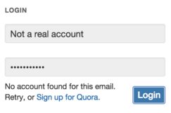 If a particular login doesn’t exist in the system, inform the user and consider giving them a link to register, or allowing them to do it right there. Quora.com is a good example of this, announcing that there’s no account for this email and prompting them to retry or sign up.
If your application has profile photos associated with accounts (or other non-sensitive data), consider displaying them when the user has trouble logging in. This way they can confirm that their access attempts are for the correct account. The display of the login picture also helps make phishing more difficult overall.
Conclusion
Ultimately, the user experience will have more of an impact on your company’s bottom line than security. Are we advocating lax security? Absolutely not. Each project has a balance that needs to be found. A bank will make different security choices than a news subscription service. The goal is to protect users while providing them a useful service so they reward you with their business.
In this growing sea of login forms, do what you can to make your application’s login experience as painless as possible. Remove barriers, eliminate frustrations, think ahead about user behavior, and anticipate their needs. Especially if they’ve forgotten their password.
Don’t risk losing business by driving away your frustrated user with a complicated, confusing login system.
The user appreciates it.