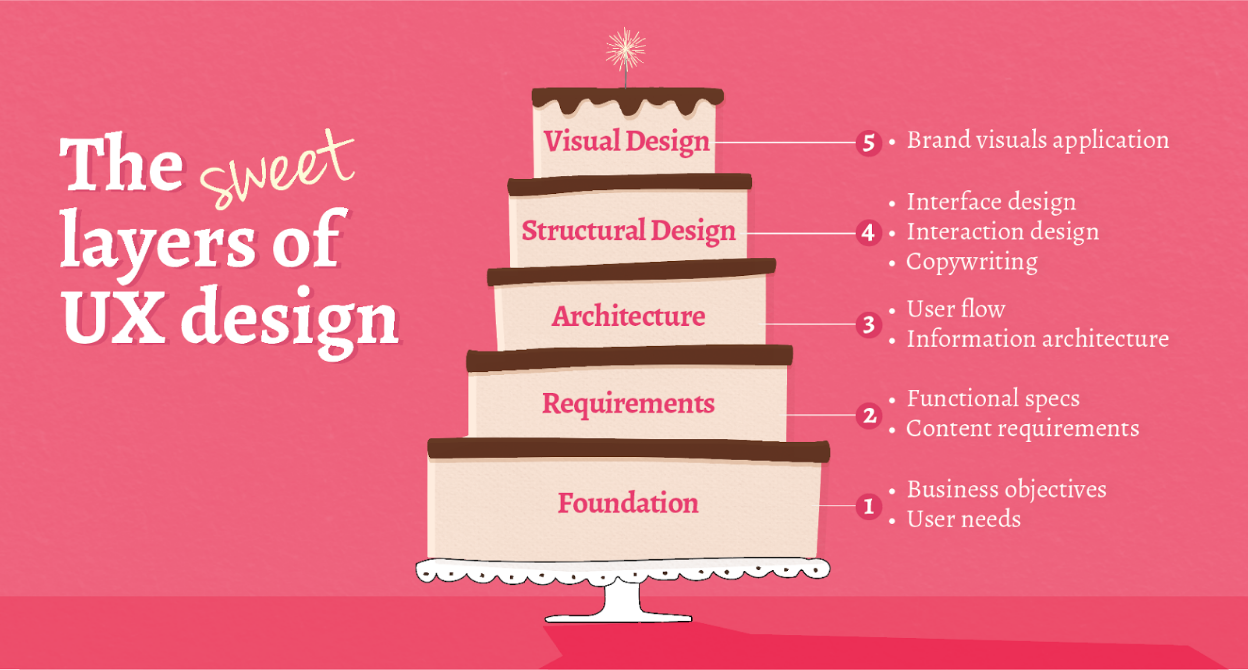
The UX process can be thought of like a multi-layer cake. Done well, the steps build on top of one another, ultimately providing a satisfying user experience.

Determine Foundation
Define goals, business objectives, and user needs
This is the base layer of any project. Supporting all subsequent layers, the strategy sets the stage for your project’s success. As you build, each layer will check back in with this foundation layer to ensure it’s effectively meeting project needs.
Keeping the desires of your users in mind alongside your own helps to create something rewarding for both parties. Clarifying vague objectives into measurable, trackable goals will ultimately help answer, “Was this project successful?”
Define Requirements
Nail down functional specs and content requirements
Building on the foundation, this next layer defines the site’s physical requirements. This is the time to determine what functionality the site must have to satisfy the business objectives and user needs. For instance, will your site need a shopping cart? What functionality does that cart need to sell products well? What content needs to be included to fulfill the user’s desires and curiosities?
Make sure to keep the user in mind. If it doesn’t add value or satisfy the user’s hunger, it might be best left out. It’s tempting to include all available content, but clutter will only dilute useful information and distract the user. Pairing down “must haves” helps clarify messaging and guide the user towards satisfying your goals and theirs.
Architecture
Map out information architecture and user flow
How is your site arranged? What story are you telling? Think back to the foundation layer–the project’s goals–and determine how a user will expect to find what they’re looking for. How are you guiding them through the site?
What pages or sections do you need to include? Producing a site map with a high-level navigation structure will help visualize how a user might maneuver. Working through various use cases will help determine if the flow is appropriate.
Consider popular design patterns and build on systems that are intuitive for the typical user. Unless your brand is edgy and looking to appeal to a radical audience, it’s best to stay within expected patterns. If you’re doing it right, the user shouldn’t have to learn new procedures to get what they want.
Structural Design
Build the interface, define interactions, refine copywriting
Once you’ve determined the pieces of the puzzle, the next step is to flesh out those pieces. Focusing more on the details, assemble a skeleton that will allow you to refine your user flow and house your copywriting.
Lorem ipsum is often used as placeholder copy, but it makes it hard to tell if your message is well conveyed unless the actual content is in place. Copy shouldn’t be a last minute consideration. For a strong result, it must work in conjunction with structure and design.
This detailed framework allows you to hone in on the effectiveness of your storytelling. Does it make sense? Are you presenting the right information at the right time? Does it draw the user in and direct them to the right places? Is it compelling? Have you been able to create an emotional connection?
Think through the user’s interactions. Is it an appropriate number of steps for the user to get what they want? Are they going to feel like they’re getting what they need? Easily?
Visual design
Translating the brand to visuals
Visual design isn’t just the icing on the cake. Okay, on a cake, it might be, but for a web experience, UX it isn’t just prettymaking. It deserves its own layer.
This step builds upon all the work that came before, translating the brand into visuals and tying it all together as a cohesive, usable interface. And just like each layer before it, it checks back in with the foundational layer. Everything should work towards enhancing user satisfaction, which ultimately enhances yours.
And, of course, design is an iterative process, so if you find yourself moving through the process and something no longer makes sense, that’s the perfect time to make adjustments. Learn each step of the way–it’s the nature of the game that it takes a few tries to get it right.
Let them eat cake!
Present your work
Congratulations! Your cake is assembled and looking delicious.
Unfortunately, you’re still not done. Taste testing is imperative before it’s ready to be presented to the world.
User testing is the heart of UX. You’ve prepared your cake using your best judgements and now it goes out for trial among discerning palettes. Since you’re not your user, until you’ve watched them eat your cake and asked them questions about it, you can’t really know what’s best for them.
You’ll learn a lot from the feedback, things you didn’t expect. Things you couldn’t anticipate. And you’ll probably need to make a good deal of changes, but that’s okay, that’s normal.
…So long as you didn’t come this far only to learn that all the customer really wanted was an ice cream sundae.


